
Flat UI Error Pages – Inspired by Windows 8 BSOD
A set of flat UI website error pages inspired by the Windows 8 Blue Screen of Death, designed to clearly communicate access issues through colour, minimal layouts, and expressive emoji.
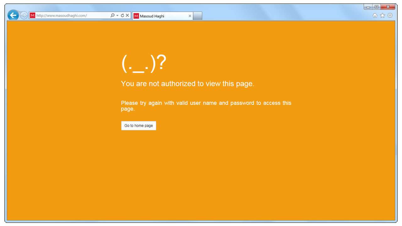
HTTP Error 401
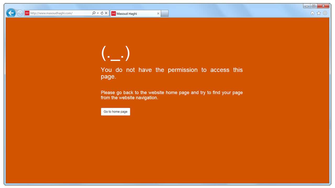
HTTP Error 403
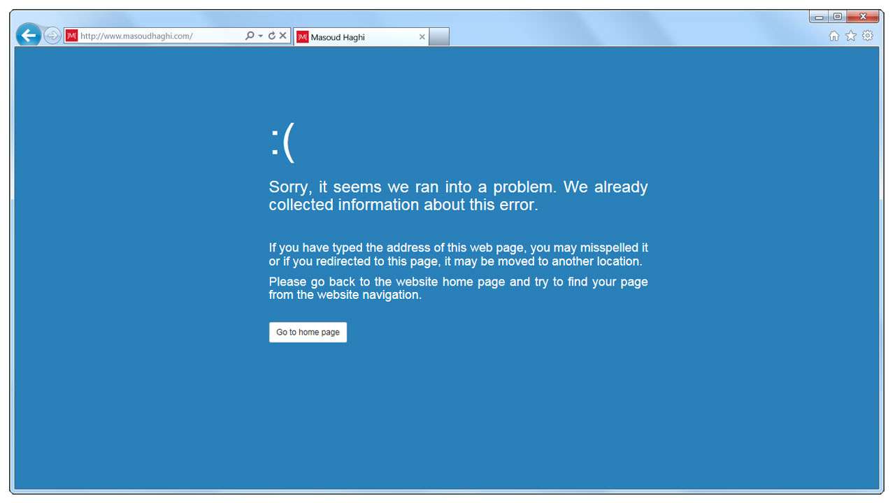
HTTP Error 404
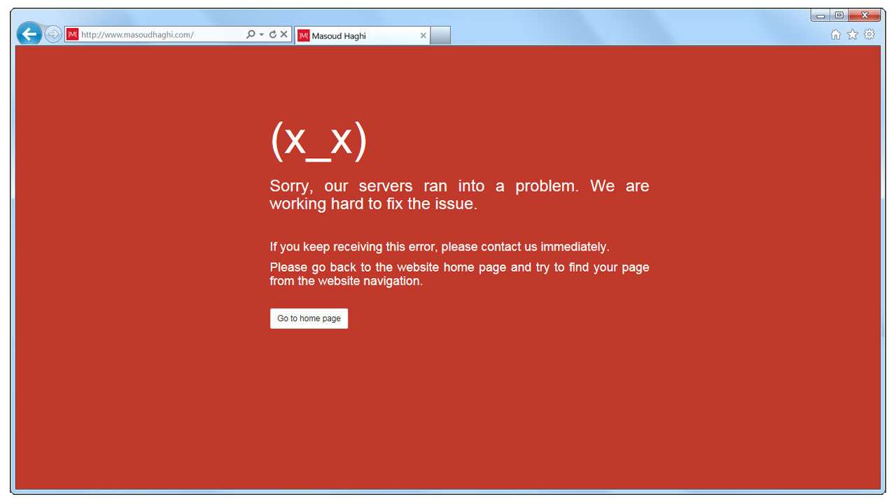
HTTP Error 500
Flat UI Error Pages – Inspired by Windows 8 BSOD
This project focuses on designing a complete set of website error handler pages, intended to inform visitors when they face accessibility or permission-related issues. Each error type—such as “404 Not Found” or “401 Unauthorized”—requires clear communication and a visual style that quickly helps the user understand what went wrong.
Inspired by the clean, bold aesthetic of the Windows 8 Blue Screen of Death (BSOD), I explored how this concept could be translated into web environments. The result is a collection of flat UI error messages that blend minimalism, clarity, and emotional tone. Expressive emoji faces were incorporated to humanize the experience and reduce user frustration, while distinct background colors help differentiate each error category at a glance.
The goal was to show that even error pages—often overlooked and purely functional—can be thoughtfully designed to enhance user experience and reinforce a brand’s visual identity.
Key Features
- Clean flat UI design inspired by Windows 8 visual style
- Emotion-driven emoji icons for better user connection
- Unique background colors for each error category
- Clear, simple messaging for easy user understanding
- Consistent layout across all error pages
- Desktop browser mockup presentation
Technical Details
- Project Type: Web UI/UX design
- Software Used: Adobe Photoshop
- Error Pages Included:
- 404 – Not Found
- 401 – Unauthorized
- 403 – Forbidden
- 500 – Internal Server Error
- Design Techniques:
- Minimal flat color palettes
- Typography hierarchy for message clarity
- UI layout alignment following Windows 8 design language
- Mockup presentation in browser windows
Process / Behind the Scenes
- Research into common website error categories and user expectations
- Studying the visual structure and emotional tone of Windows 8 BSOD
- Designing a uniform layout adaptable across all error types
- Selecting colors to represent severity and message tone
- Integrating emoji expressions to add personality and clarity
- Mocking up final pages inside browser window frames for presentation
Outcome & Impact
The resulting set of error pages provides websites with a stylish, user‑friendly way to communicate access issues, improving the user experience during otherwise frustrating moments. Clear colors, expressive icons, and simple wording help users understand the problem instantly and guide them toward the appropriate next step.
This project demonstrates how even the most functional components of a website—like error messages—benefit from thoughtful design, emotional awareness, and consistent branding.