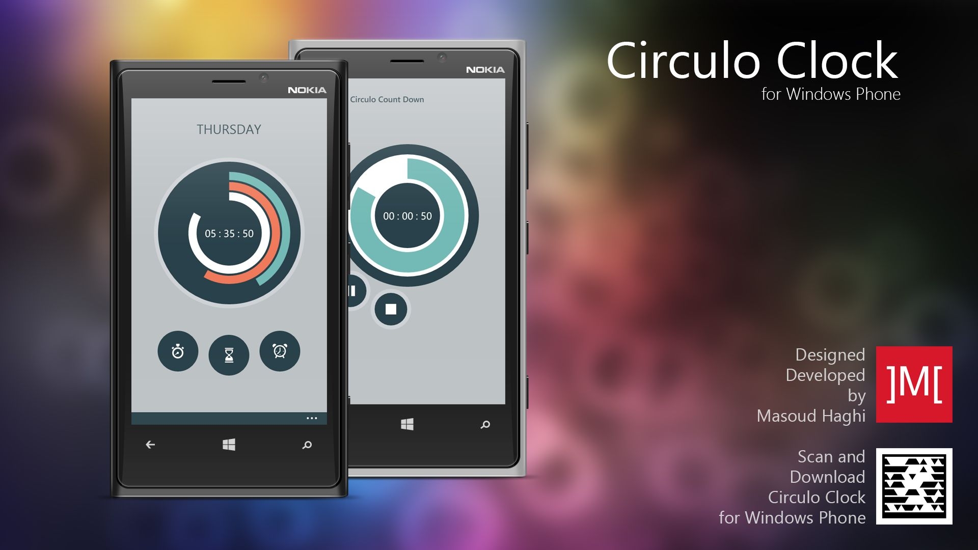
The idea was to reimagine time display in a way that was both functional and artistic. By using progress bars, users could see the passage of time at a glance.
Inspired by fitness trackers and circular UI elements, I designed Circulo Clock to be both functional and visually engaging. It combined stopwatch, timer, and alarm features into a single circular interface.
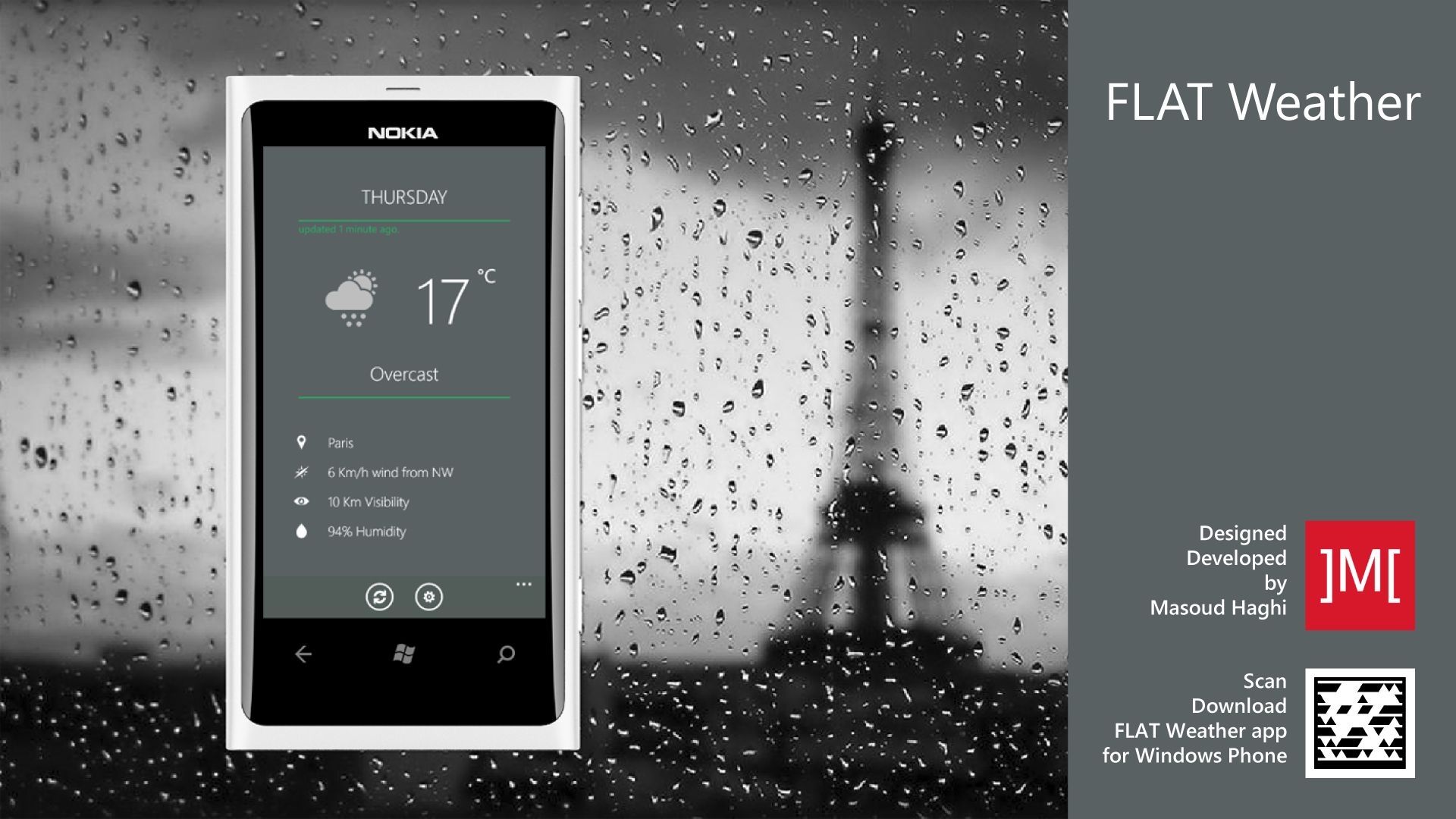
At the time, many weather apps were cluttered with ads and unnecessary features. I wanted to create a minimalist alternative that focused on delivering accurate weather data in a visually appealing way.
Students often had to juggle multiple platforms for schedules, bus tracking, and campus updates. I built the APU app to simplify student life, integrating everything into a single, intuitive interface.
Users loved the idea of having a glanceable clock without unlocking their phone. However, hardware limitations meant many couldn’t access the feature. I created Amber Clock to bridge that gap, offering a battery‑efficient, AMOLED‑style display that worked even on unsupported devices.
The idea came from wanting a minimalist, always-on display that could serve as both a clock and an information hub. Wall Clock was built as a web app, making it accessible across devices and easy to customize.
Before streaming services dominated, TV schedules were still essential. I built this app to give users a modern, mobile-friendly way to browse listings, set reminders, and discover new shows.
MY Flights was a Windows Phone app that provided real-time flight tracking for domestic and international flights in Malaysia. It also integrated weather data to give travellers a complete overview of their journey.
In today’s competitive business landscape, a strong and recognizable brand identity is essential for any company aiming to stand out—especially in markets crowded with similar services. Many businesses underestimate how powerful a logo, colour scheme, and consistent visual identity can be. While customers may forget a company name or slogan, they almost always remember a distinctive logo and the feelings it conveys.
Before any software product is developed, the first essential step is to visualize how the final system will look and function. Wireframing plays a crucial role in this early phase by allowing designers and stakeholders to define the structure, navigation flow, and user interactions long before development begins.
Entertainment websites face a unique challenge: the audience must be engaged instantly. Long loading times, static visuals, or delays in multimedia playback quickly lead to boredom—especially in sports‑themed platforms where energy and excitement are key.
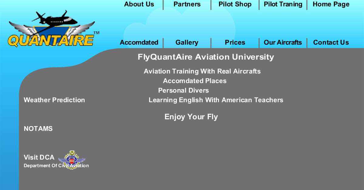
FlyQuantaire, founded in 2006, was a growing aviation community and training school offering city sky tours, flight training programs, and aviation services. To attract tourists, aspiring pilots, and aviation enthusiasts, the organization needed a website that delivered both visual impact and professional presentation.
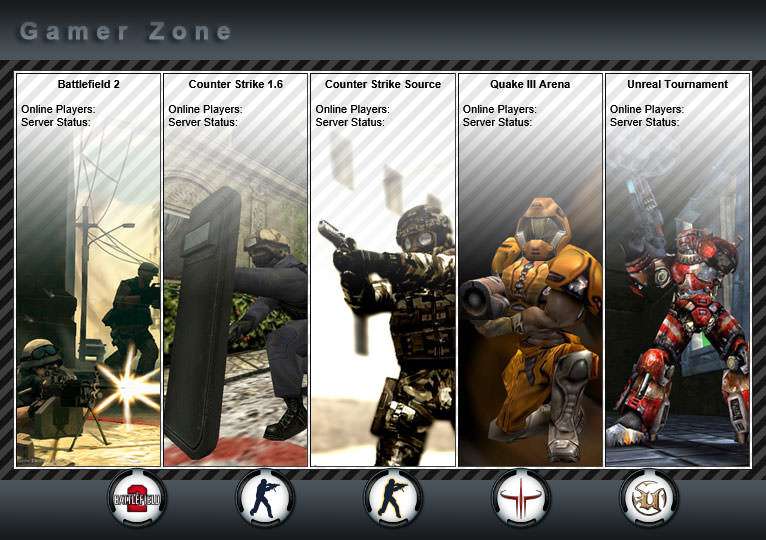
This project was designed as a landing page for a multiplayer gaming server, providing players with a quick overview of available games, server activity, and player statistics. At a time when competitive multiplayer communities relied heavily on dedicated servers, having a central hub where players could monitor server status and activity was essential.
In the early days of the web, Flash‑heavy websites with intricate animations and graphics were extremely popular. While visually impressive, they often came with a major drawback: slow loading times, especially on limited internet connections and less capable browsers. Users were forced to wait through lengthy preloaders before accessing even basic content.
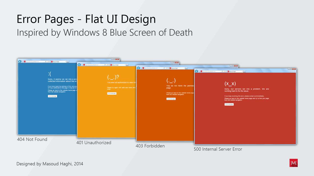
This project focuses on designing a complete set of website error handler pages, intended to inform visitors when they face accessibility or permission-related issues. Each error type—such as “404 Not Found” or “401 Unauthorized”—requires clear communication and a visual style that quickly helps the user understand what went wrong.
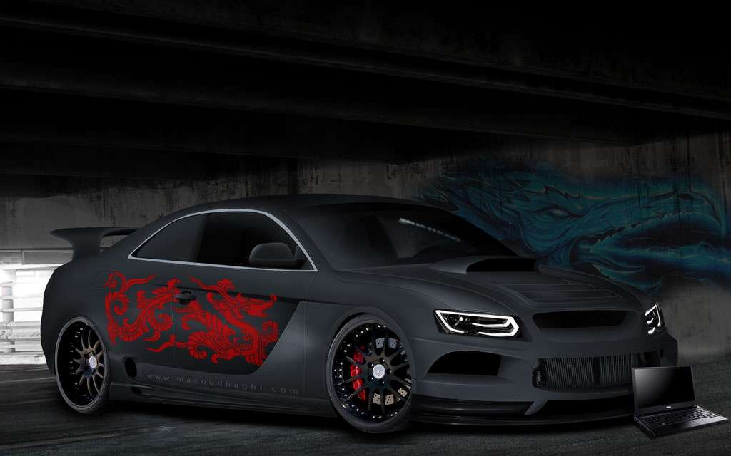
In this second personal project, I took on the challenge of virtually tuning a stock Audi A5, pushing my creativity and technical skills further. The aim was to create a visually captivating racing concept that reflects strength and agility, featuring a bold Chinese dragon decal that adds cultural significance and flair.